Selection Elements
Selection field
A field offering to the person filling in the form to select the option provided.
Editing and settings of the element:
Enter the entry field description. In the editing mode, if you click (mark) on the selction field and then confirm the change, then this field will be deleted by default, once the online form sheet will open up to the person who is supposed to fill it in.
Selection field group
It offers the choice of one, several or none of the options (answers) provided.If you wish for the person filling in the form to select but one of the options on offer, chiise the radio button element or a dropdown list.

Editing and settings of the element:
In the left field, enter the sescription of the selection field group. On the right side, enter the descriptions of the options to choose from.
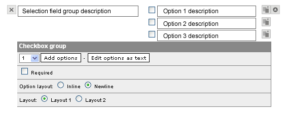
.thumb.gif) If you wish to delete or rearrange any of the options, cick on the OPTION ACTION
If you wish to delete or rearrange any of the options, cick on the OPTION ACTION  button located to the right of the option description field. This will display a menu allowing you to erase or reposition the option.
In the additional element settings, it is possible to add the options to choose from. From the dropdown list, select the number of options you would like to add, and click on the ADD OPTIONS button. New options will be added below the exisiting ones, and you will then enter the descriptions of the newly added options.
If in the editing mode you click (mark) all or some of the selection fields and then confirm the change, these fields will be selected by default when the online form will open up to the person who is supposed to fill it in.
Radio buttons
This type offers to the person filling in the form the choice of selecting only on of the options (answers) on offer. The radio buttons element functions very similarly to the selection field group element. Design-wise, they are different because radio buttons are round fields, while selection field groups feature square fields. What is really important is the difference in content or purpose of use: while it is possible to choose one, several or no fields from a selection field group, radio buttons only allow for the selection of one option.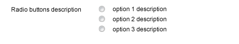
Editing and settings of the element:
In the left field, enter the sescription of the selection field group. On the right side, enter the descriptions of the options to choose from.
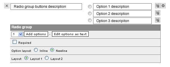 If you wish to delete or rearrange any of the options, cick on the OPTION ACTION button located to the right of the option description field. This will display a menu allowing you to erase or reposition the option.
In the additional element settings, it is possible to add the options to choose from. From the dropdown list, select the number of options you would like to add, and click on the ADD OPTIONS button. New options will be added below the exisiting ones, and you will then enter the descriptions of the newly added options.
If in the editing mode you click (mark) any of the radio buttons and then confirm the change, this radio button will be selected by default when the online form will open up to the person who is supposed to fill it in. If in the editing mode you select none of the radio buttons, then the default selection will be the first radio button.
Dropdown list
It enables the person filling in the form to select just one of the options on offer that are hidden in the dropdown list that must be clicked in order to open up. This element is especislly useful when there is a lot of options to choose from and the use of radio buttons would take up too much spac in the online form sheet.
Attention: the descriptions of the options in the dropdown list can only be as long as the width of the dropdown list will allow for. Longer descriptions are not divided into several lines. When the descriptions exceed the width of the dropdown list, some web browsers will cut them to the width of the dropdown list. With long optikon descriptions, it is better to use radio buttons or selection field groups
Editing and settings of the element:
In the left field, enter the description of the dropdown list. Click on the ADDITIONAL ELEMENT SETTINGS
 button. This will display the fields for the description of the options offered when the person filling in the form will click on the list.
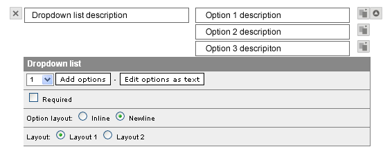 If you wish to delete or rearrange any of the options, cick on the OPTION ACTION button located to the right of the option description field. This will display a menu allowing you to erase or reposition the option.
In the additional element settings, it is possible to add the options to choose from. From the dropdown list, select the number of options you would like to add, and click on the ADD OPTIONS button. New options will be added below the exisiting ones, and you will then enter the descriptions of the newly added options.
By default, the first option will be selected and visible. If you wish another option to be shown as default, click on the ADDITIONAL ELEMENT SETTINGS
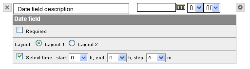
BUTTON, close the editing of the additional elelment settings, select the options to be selected by default from the dropdown list and confirma these changes.Date field
An entry field for date and, if needed, time. Next to the entry field, an icon containing the link to the calendar is displayed, from which the person filling in the form will be able to select the desired date.
Editing and settings of the element:
In the left field, enter the descripton or what the person filling in the form is supposed to enter into the right entry field.
Additional settings offer the possibility of also selecting the time of day. The options at hand are what daytime period and time intervals.